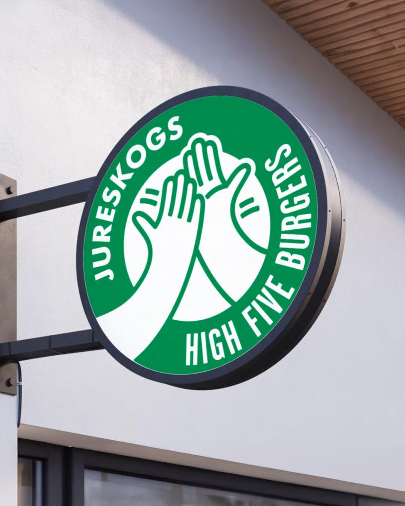
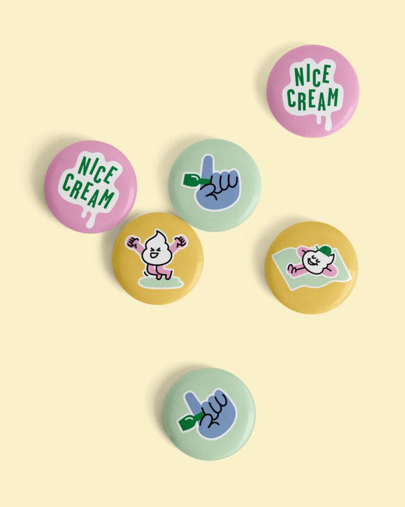
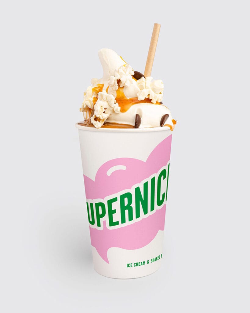
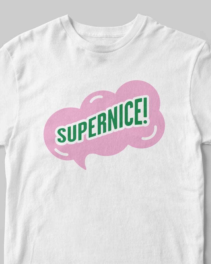
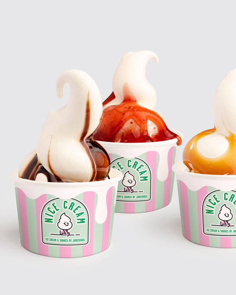
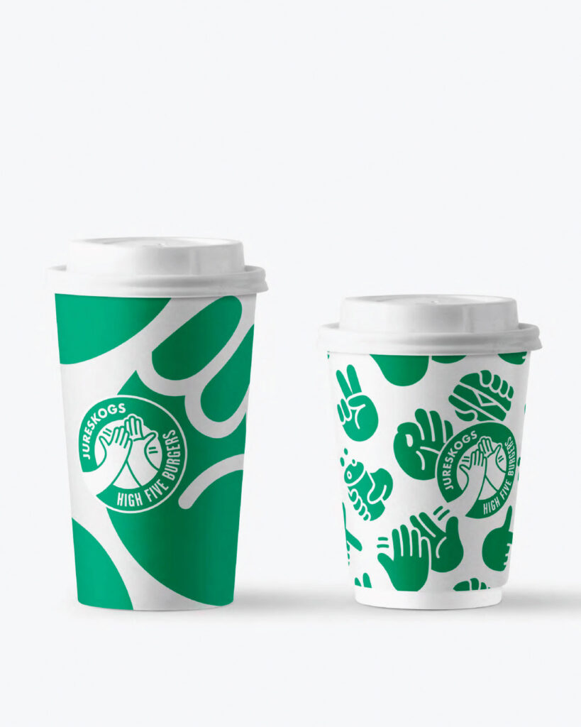
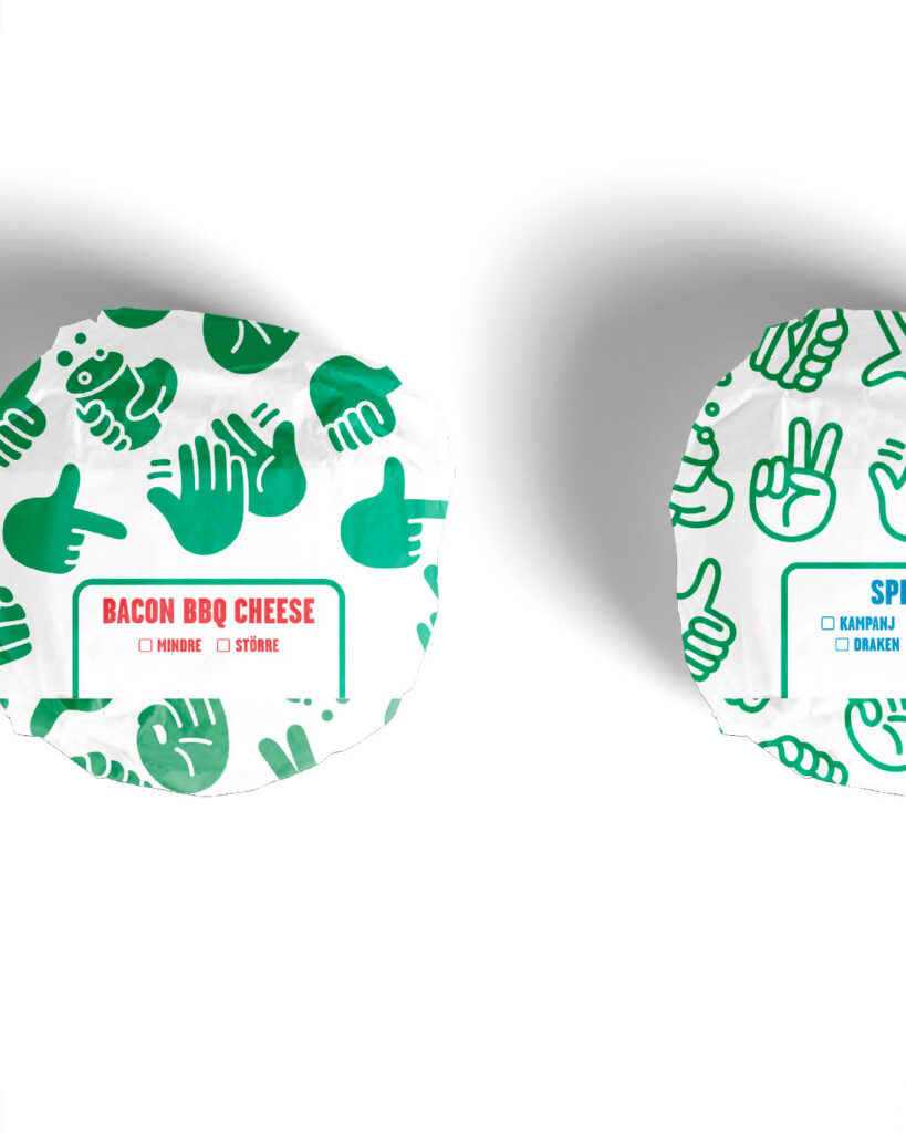
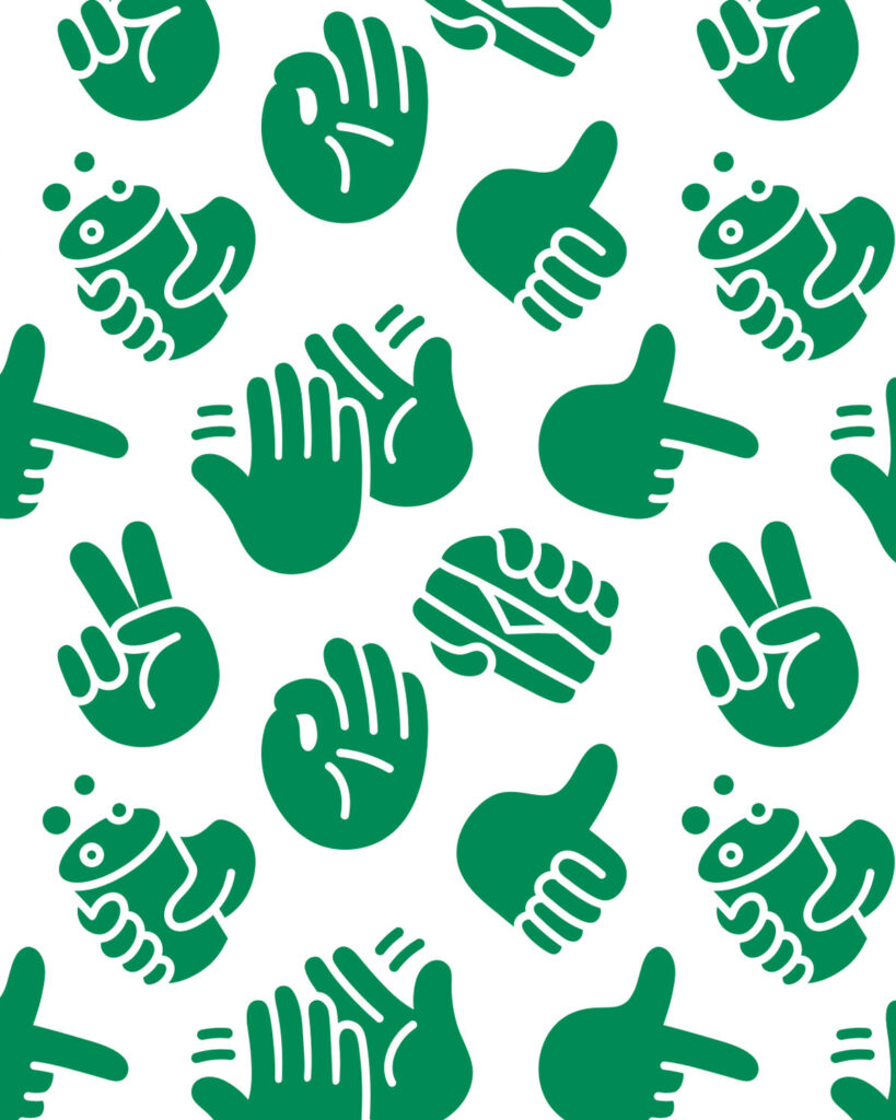
We updated the Jureskogs logo together with Gärde Design, adding the hands as a nod to their signature burger, High Five. From there, we created a packaging identity where the hands lead the way — a bold, playful system that ties the whole range together, including their ice cream concept, Nicecream.

Skogsvakten is a small, personal forestry partner built on trust and care. This mindset shaped an identity design that moves away from corporate aesthetics toward something organic, hand-drawn, and crafted. At its heart is the Siberian jay — a symbol of presence, perspective, and a deep connection to the forest, moving from the big picture down to the smallest details.

Our long-term collaboration with the Japanese company Askul has resulted in a wide range of products. In true Scandinavian spirit, the challenge is to let functional objects become something you don’t need to hide away — pieces that blend quietly into the home, adding warmth, simplicity, and a sense of calm to daily life.

A few years into their journey, we worked with Picky Living — creators of custom fronts designed to fit IKEA cabinet bases — to redefine their brand and sharpen their position in the market through a refreshed identity. The project focused on clarity, confidence, and differentiation.


Book design for Trendenser’s best-selling The Interior Design Handbook, capturing the minimalist and long-term, thoughtful approach that defines Frida Ramstedt’s Trendenser. A quiet, structured design language that lets the content speak — timeless, clear and deeply Scandinavian.


Identity design for the premium retreat Villa Solbacka in the Stockholm Archipelago, capturing both the character of the place and the soul of its houses. A calm, refined visual language inspired by the surrounding pine forests, shifting light and the timeless craftsmanship of the property itself — designed to evoke serenity, belonging and a sense of arriving somewhere truly special.

We created the identity design for the outdoor and hunting platform Natlink. The arch — shaped by the “N” in both the logo and the symbol — represents the connection between nature, people, and their dogs. It stands for the link to extraordinary outdoor experiences and functions as a bridge between two waypoints. The clean and simple design pays homage to our Nordic design heritage, evoking a sense of quality, clarity, and user-friendliness.


We developed the identity design for 100 Samtal for Sveriges Museer, a concept combining a live podcast tour with a book and an exhibition. The project explores contrasts and contradictions within the topics addressed, using the tension between high and low as a guiding principle throughout the visual identity.